Normally, stats is not considered funny but I'm finding a lot of fun in the following charts and graphs:
-Ogives- a rounded curve

from here http://www.rasch.org/rmt/rmt62a.htm
-Stem and Leaf Plots- reminds me of counting in math using place value.
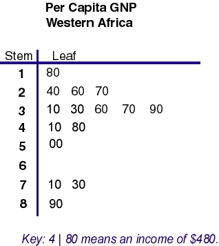
from here http://mainland.cctt.org/mathsummer/JosephBond/StemAndPlots/stem-and-leaf_std.htm
-Whisker and box Plots- looks at how your data is skewed to the right or left of your mean.
